When someone in your area searches for the service you offer and lands on your page, you have maybe five seconds to convince them to stay. That’s it. Five seconds before they hit the back button and call your competitor.
Most local business landing pages lose people in those five seconds not because the business is bad, but because the page doesn’t speak clearly to what the visitor needs right now.
This guide is for local business owners who want to turn more visitors into actual phone calls, enquiries, and walk-ins. No fluff. Just what actually works in 2026.
Why Local Landing Pages Are Different
A landing page for a local business isn’t the same as a generic product page or a national brand’s campaign page. Your visitors are almost always in decision mode; they’ve already searched for something specific, they’re comparing two or three local options, and they want a reason to pick you.
That changes everything about how your page should be structured.
They’re not browsing. They’re evaluating. And what they’re evaluating is simple: Can I trust this business? Are they nearby? Can they solve my problem quickly?
Your landing page needs to answer all three of those questions within the first scroll.
Start With One Clear Message Above the Fold
The section of your page visible before someone scrolls is the most valuable real estate on your entire website. Most local businesses waste it with a vague tagline, a stock photo, and a generic “Welcome to our website” headline.
Instead, your above-the-fold section should do three things:
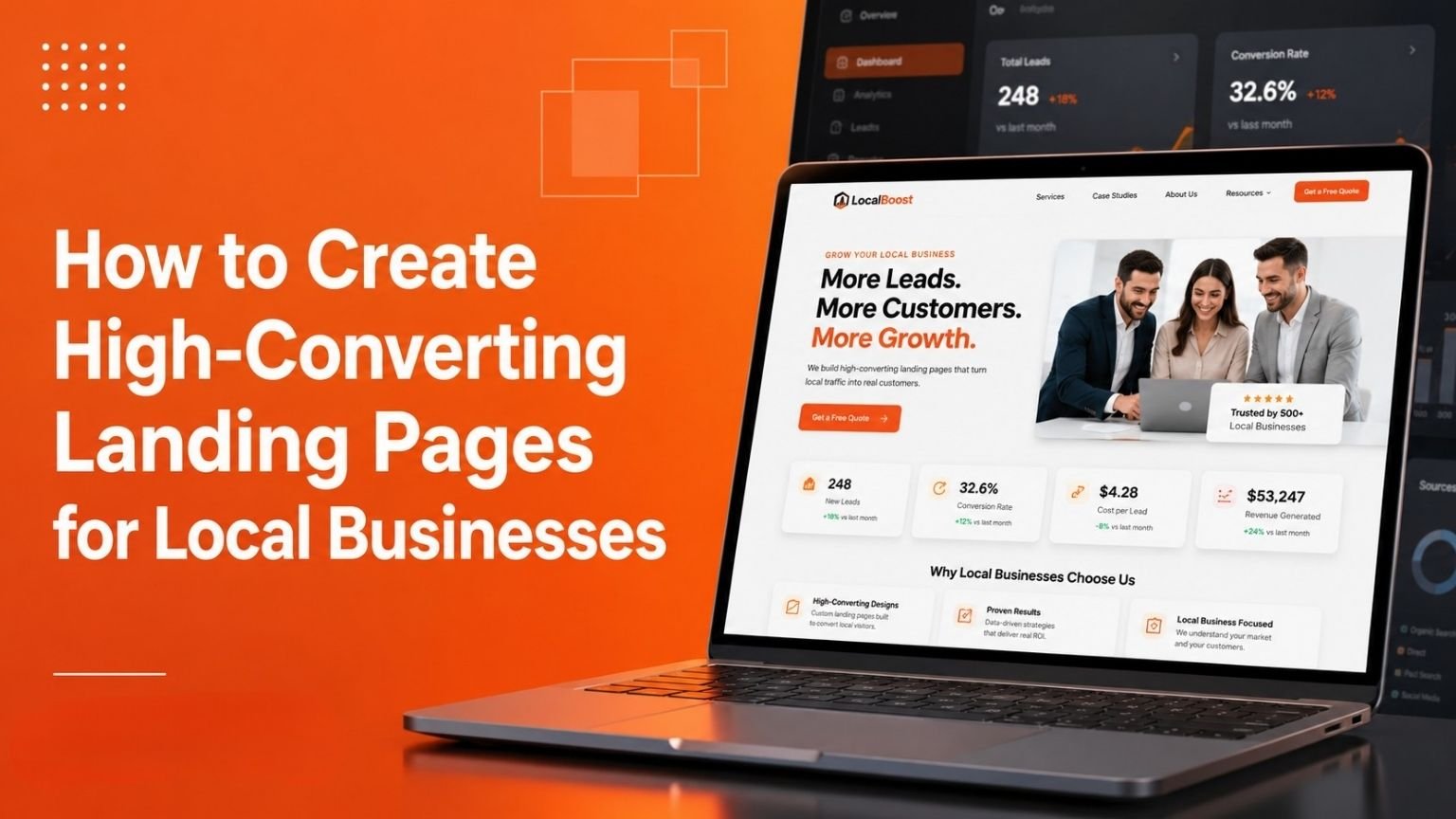
Tell them exactly what you do and where. Don’t assume they know. If you’re a plumber in Parramatta, say “Emergency Plumber in Parramatta Available 24/7.” That’s your headline. Clear, local, specific.
Show a photo of your actual work or your actual team. People in your area want to see that you’re real. A photo of your shop front, your team on a job site, or a recent project you completed does more for trust than any stock image ever could.
Put your phone number or booking button where they can’t miss it. Local searchers are often on mobile. Make it a tap-to-call button. Put it at the top right corner and repeat it again mid-page and at the bottom.
Build Trust Before You Ask for Anything
Here’s a mistake almost every local business makes: they ask for the enquiry before they’ve given any reason to trust them.
Think about it from your visitor’s perspective. They’ve landed on your page from a search. They don’t know you. They’ve probably been burned by a dodgy tradie or service provider before. Why would they hand over their phone number or email to a stranger?
You need to earn that click. Here’s how.
Show real reviews with real names. Not “John D. Five stars.” That could be anyone. Use Google review embeds where people can see the reviewer’s profile. Or screenshot reviews with the reviewer’s full name and suburb visible. If you have reviews that mention your suburb or the specific service, those are gold and feature them prominently.
Show your face. A short paragraph about who you are, how long you’ve been serving the local area, and why you started the business goes a long way. People buy from people they feel they know. A photo of you not a logo, you create a connection a generic business name never can.
List your credentials where they’re relevant. If you’re a licensed electrician, a certified accountant, or an insured landscaper, say so. And if you have industry memberships or local business association affiliations, put those logos on the page. These are trust signals that matter to local customers.
Don’t hide your address. A surprising number of local business websites don’t display a physical address. This kills trust immediately. Even if you run a mobile service and don’t have a shopfront, listing your service area clearly (“Servicing all of Greater Western Sydney”) tells people you’re a real, local business.
Structure Your Page for How People Actually Read
People don’t read web pages the same way they read a book. They scan. Their eyes jump to headings, bold text, images, and buttons. Only when something catches their attention do they slow down and read.
Your landing page structure should work with that behaviour, not against it.
A layout that converts well for local businesses generally follows this order:
Headline and hero section who you are, what you do, where you operate, one strong call to action.
The problem you solve is a short paragraph or a few dot points describing the situation your ideal customer is in when they find you. If you’re a bookkeeper, that might be: “Running behind on your BAS? Drowning in receipts?” People feel seen when you describe their problem accurately.
Your solution, how you solve it, simply explained. This isn’t a feature list. It’s a plain-English explanation of what working with you looks like.
Social proof reviews, testimonials, case studies, or project photos. This section does the heavy lifting in the middle of the page for visitors who’ve scrolled but haven’t converted yet.
You offer a clear reason to act now. This doesn’t have to be a discount. It can be “Free consultation this week” or “Same-day quotes available.” Give them a reason to reach out today rather than tomorrow.
Call to action a contact form, a phone number, a booking link, or all three. Keep the form short. Name, phone, and one question about what they need is enough. Every extra field you add costs you enquiries.
Mobile Comes First, Always
More than half of local searches happen on a phone. In many service categories emergency tradies, restaurants, beauty services it’s closer to three quarters.
If your landing page isn’t built for mobile, you’re losing more than half your potential enquiries before they even begin.
What mobile-first actually means in practice:
Your text needs to be readable without zooming, buttons need to be large enough to tap with a thumb, page needs to load fast on a 4G connection, phone number needs to be a tap-to-call link, and contact form needs to work without a keyboard going haywire.
Test your own page on your phone right now. Go to your site on mobile and try to make an inquiry as if you were a customer. If anything feels clunky or slow, that’s exactly what your customers are experiencing and a large portion of them are leaving because of it.
Don’t Ignore Local SEO Signals on Your Landing Page
Your landing page doesn’t just convert visitors, it also needs to be found in the first place. The two goals aren’t in conflict, but they do need to work together.
For local search, your landing page should naturally include your suburb or region in the headline, the body text, and the meta title. It should mention the specific services you offer, not just vague category names. And it should include your full business name, address, and phone number what’s called your NAP consistently with how it appears on Google Business Profile.
If you serve multiple suburbs, build separate landing pages for each location rather than trying to cram every suburb into one page. A page that’s genuinely about your Penrith service, written for Penrith customers, will outperform a generic page that lists fifteen suburbs every time.
Schema markup for local businesses is also worth implementing. It helps Google understand your business type, location, and opening hours directly from your page. Your web developer can add this in an afternoon, and it can meaningfully improve how your listing appears in search results.
What Actually Kills Local Landing Page Conversions
Before wrapping up, it’s worth calling out the things that consistently destroy conversion rates on local business pages because most of them are easy to fix.
Slow load time. If your page takes longer than three seconds to load on mobile, most visitors will leave. Large uncompressed images are usually the culprit. Compress every image before uploading.
Too many options. A page that promotes your full range of services, links to your blog, shows your Instagram feed, and asks people to sign up for a newsletter is a page that converts nobody. One page, one goal. Strip everything that isn’t directly related to getting an inquiry.
Generic copy. “We’re passionate about delivering exceptional service” tells your visitor absolutely nothing. Be specific. What do you actually do? For whom? In which areas? What makes working with you different from calling the next business on the list?
No urgency. People procrastinate. If there’s no reason to reach out today, they’ll mean to get back to it and never do. You don’t need a fake countdown timer. You just need a genuine reason to act now: limited availability, a seasonal offer, same-day service, free first consultation.
Broken or hard-to-find contact options. If someone has to hunt for your phone number or email, they won’t. It should be visible from every section of the page without scrolling back up.
A Final Word on Trust
At the end of the day, a high-converting local landing page is just a trustworthy one. It tells people clearly what you do, shows them you’ve done it well for others like them, makes it easy to reach out, and gives them a reason to do it now rather than later.
Local business is built on reputation. Your landing page is your digital reputation and for many potential customers, it’s the first impression they’ll ever have of you. Make it count.
If you’re based in NSW and want a second opinion on what your landing page is or isn’t doing, feel free to reach out through the contact page. We look at these things every day and we’re happy to share what we see.
This article was written for NSW Business Today a resource for local NSW businesses looking to grow their online presence.